

Brand identity for a smart-home company — mark, system and the book that holds it together
Brand identity · Guidelines · Website · Interactive brandbook
01 — The name
Mirai means future
A smart-home company needed an identity that could sit on a product box, a delivery van and a phone screen without ever looking like three different companies.
We built the mark from one geometric frame, then derived everything from it — the logomark, the pattern, the way the gradients move.
The result is a system, not a logo: a 39-page book that tells a designer, a marketer and a factory exactly what to do.
02 — The mark

Four lockups — horizontal, with slogan, vertical, and the mark alone — with clear space measured by the symbol itself and minimum sizes down to 40 px on screen.
03 — Colour
Eight, and only two of them lead
04 — Gradients



Height is fixed, width is free: crop a gradient sideways to fit any format, never stretch it. Two sets — light for energy, dark for depth.
05 — Typography
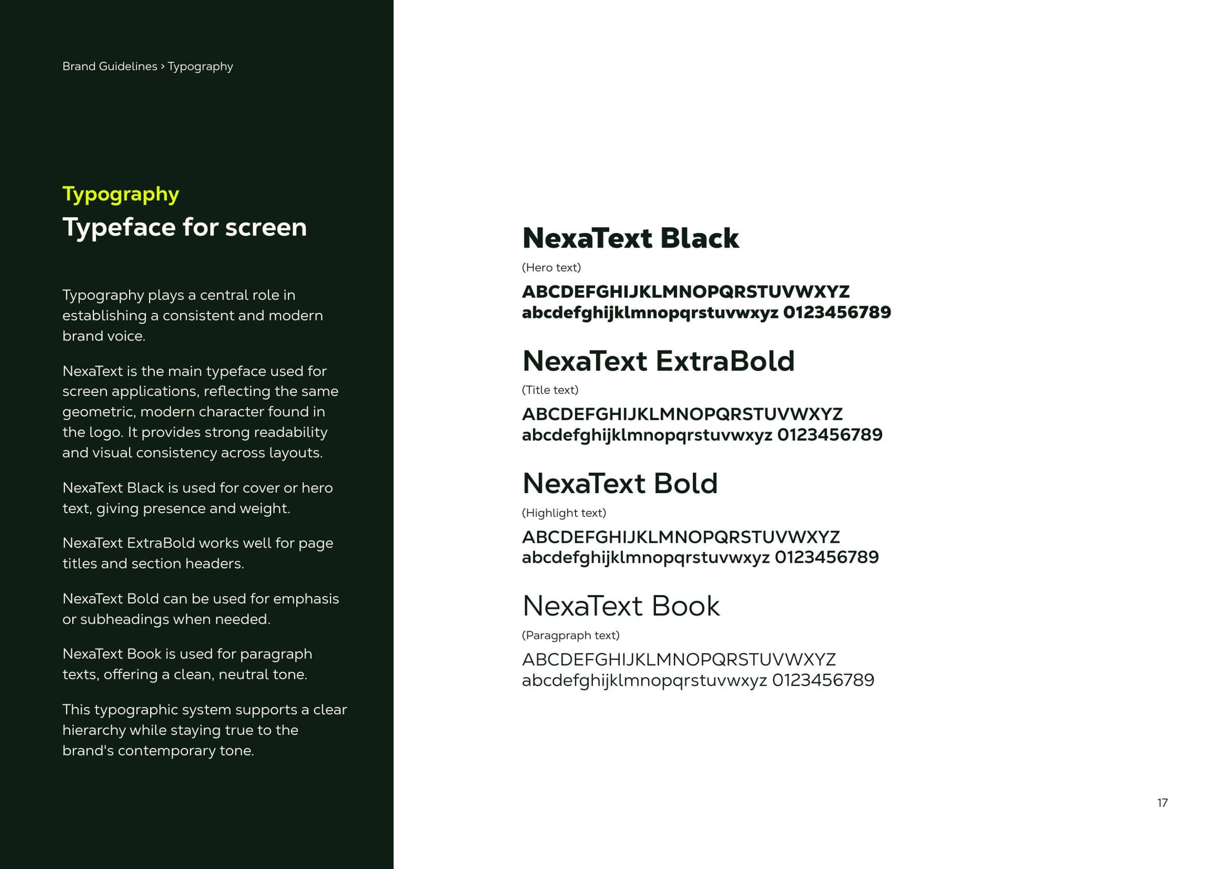
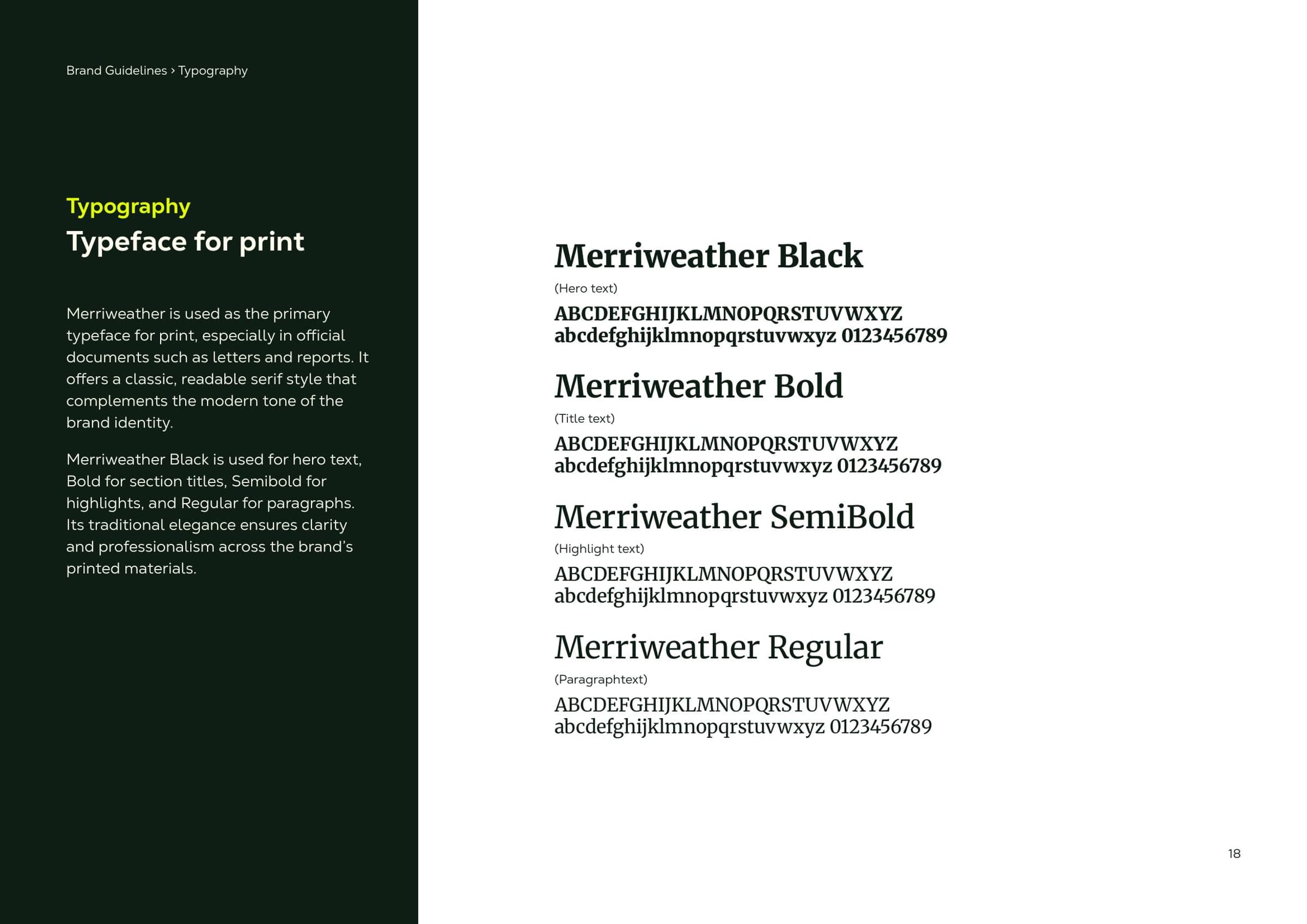
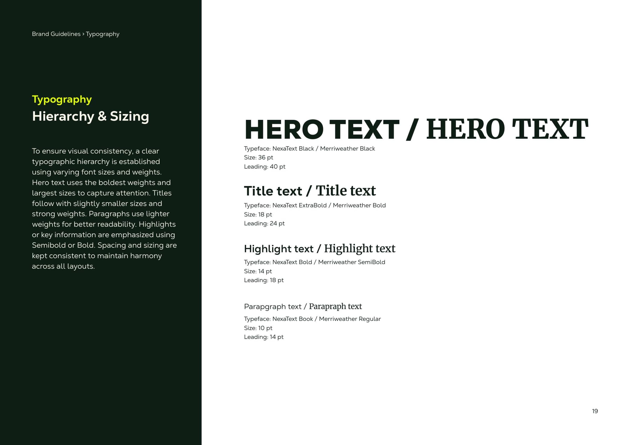
NexaText carries the screen, Merriweather carries print — one geometric, one classical, both cut to the same hierarchy so a letter and a landing page speak with one voice.
06 — Pattern
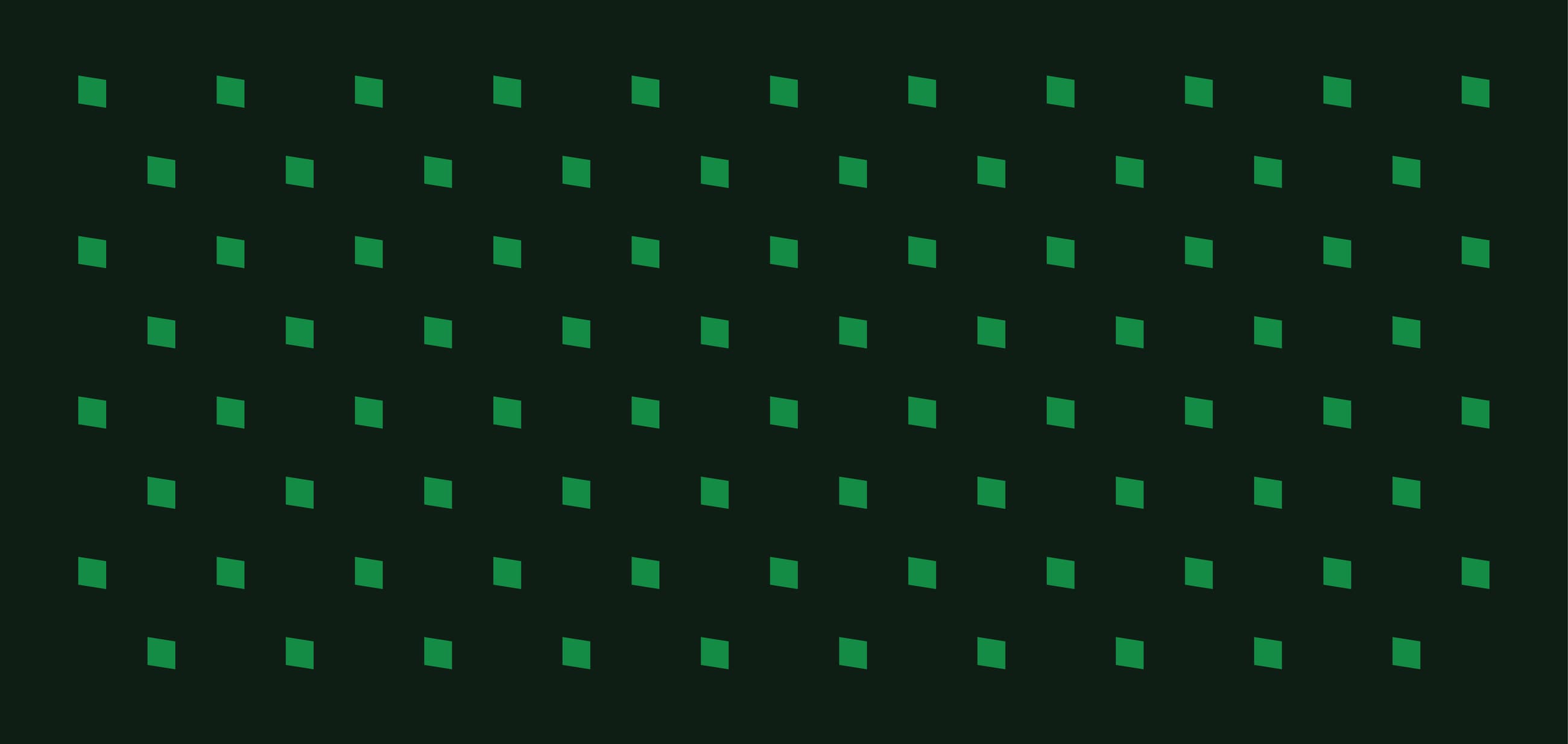
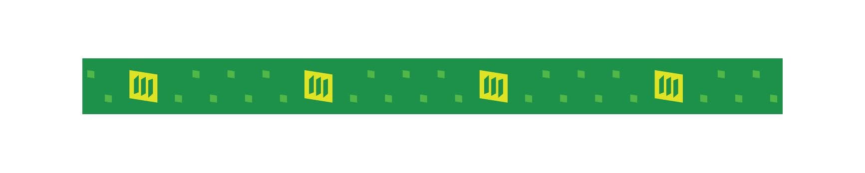
The pattern is the symbol’s own frame, repeated. It goes on solid colour only — never over an image, never rotated, never louder than the logo standing on it.
07 — Applications
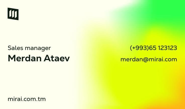
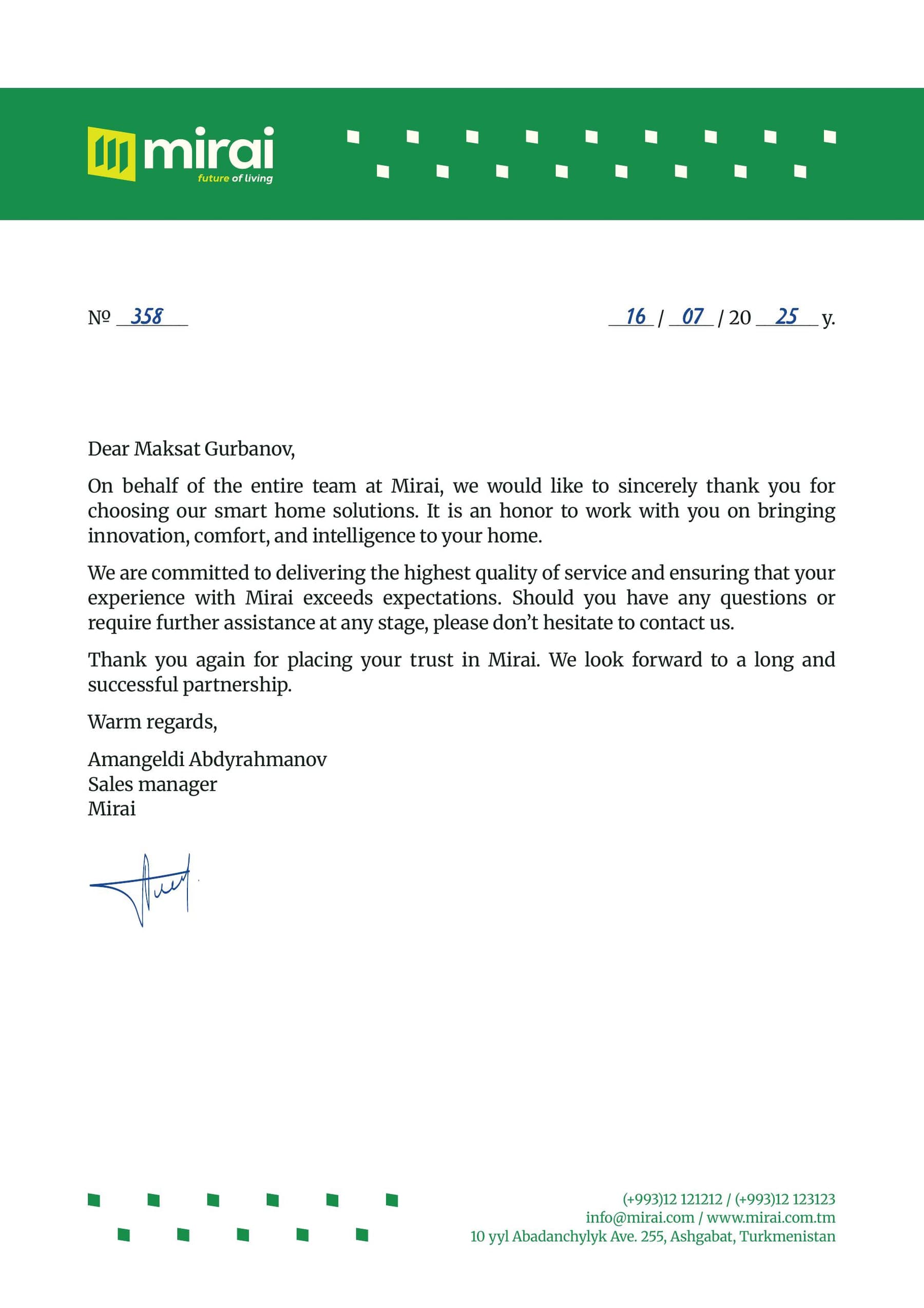
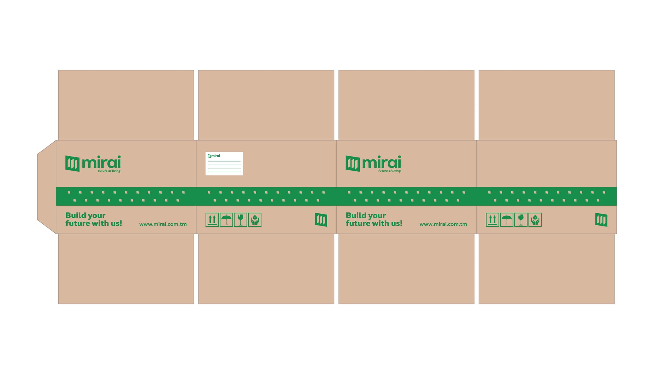
0
pages of guidelines
0
colours, two of them leading
0
files handed over
Handed over
A 39-page brand book a designer, a marketer or a factory can act on without asking
Every asset delivered in vector and raster, colour and mono, light and dark
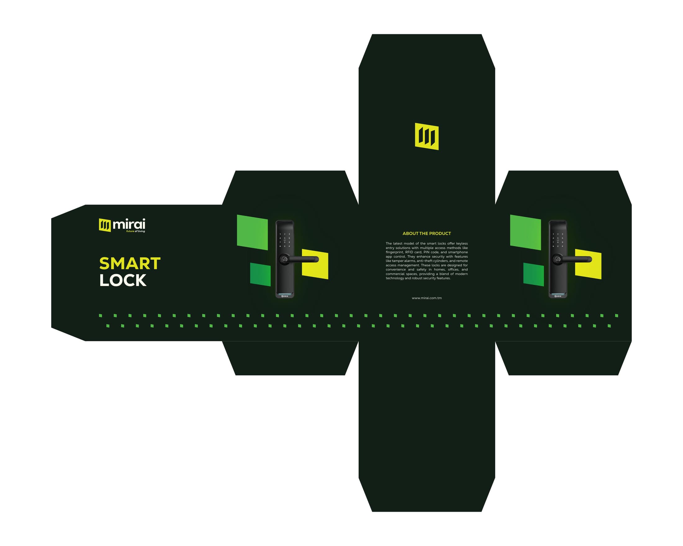
One identity that reads the same on a phone screen and on a cardboard box
The guidelines live at a URL — the team reads the rules where they work, not in a PDF attachment