Aydym
Rebrand of the largest music streaming platform in Turkmenistan — mark, colour, type and the book that holds it
Brand identity · Guidelines · Applications
01 — The mark
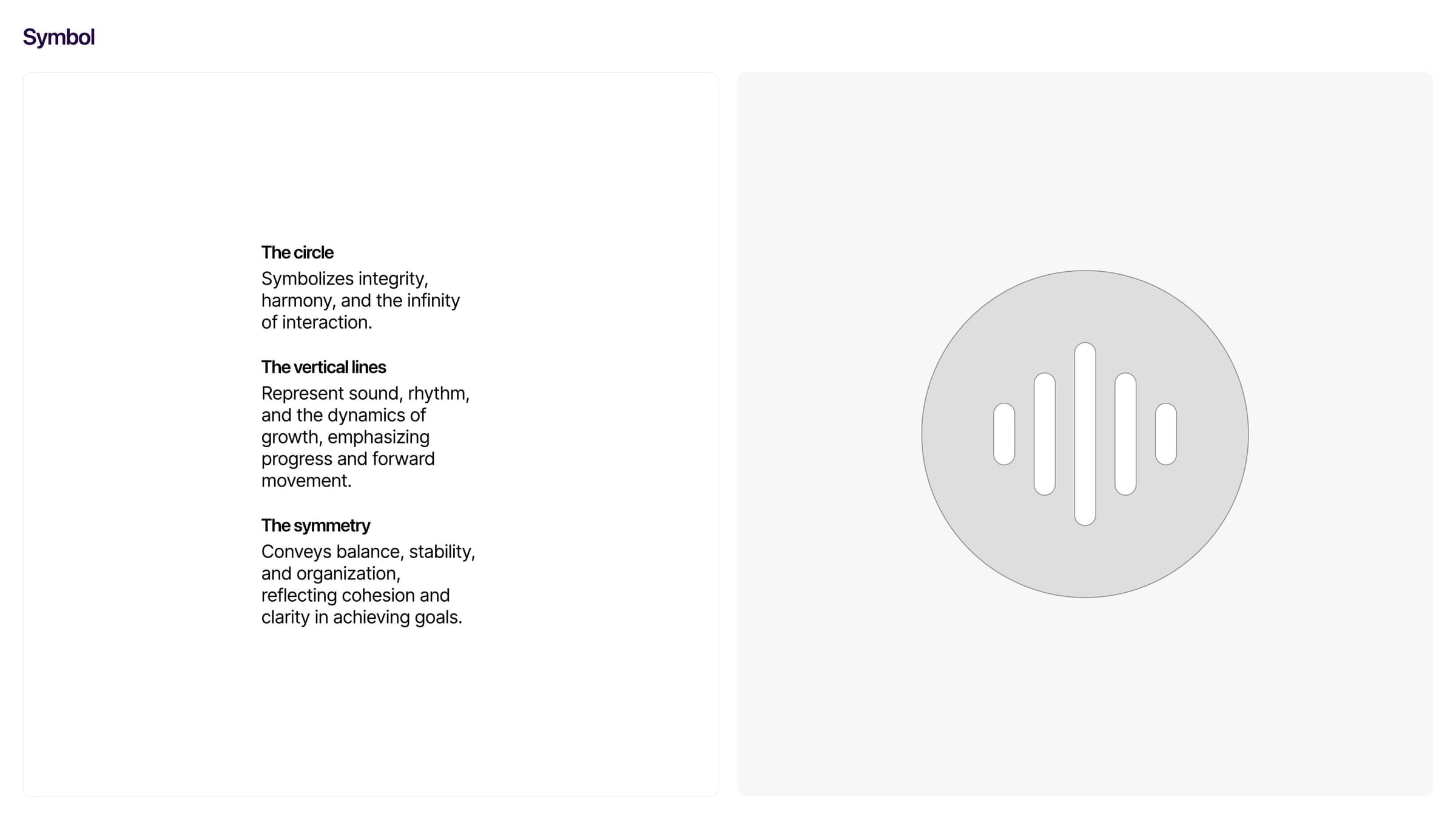
A circle that is also a play button
The circle stands for integrity and for the infinity of listening — and reads as the button every music app is judged by.
The vertical bars inside are sound: rhythm, waveform, the range of genres the platform carries.
Their symmetry is the balance the product promises — clarity in something as unruly as a music library.
03 — Colour
Eight, and only two of them lead
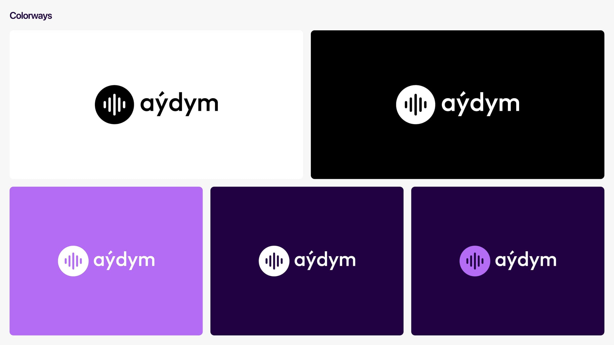
Cosmic Violet leads, black carries the room — the dark theme is not a mode here, it is the brand. The other three are states, not decoration: positive, friendly, smart.
02 — The system, page by page
03 — Pattern

The bars of the symbol laid on their side and repeated — a texture that belongs to the mark instead of being borrowed from a library.
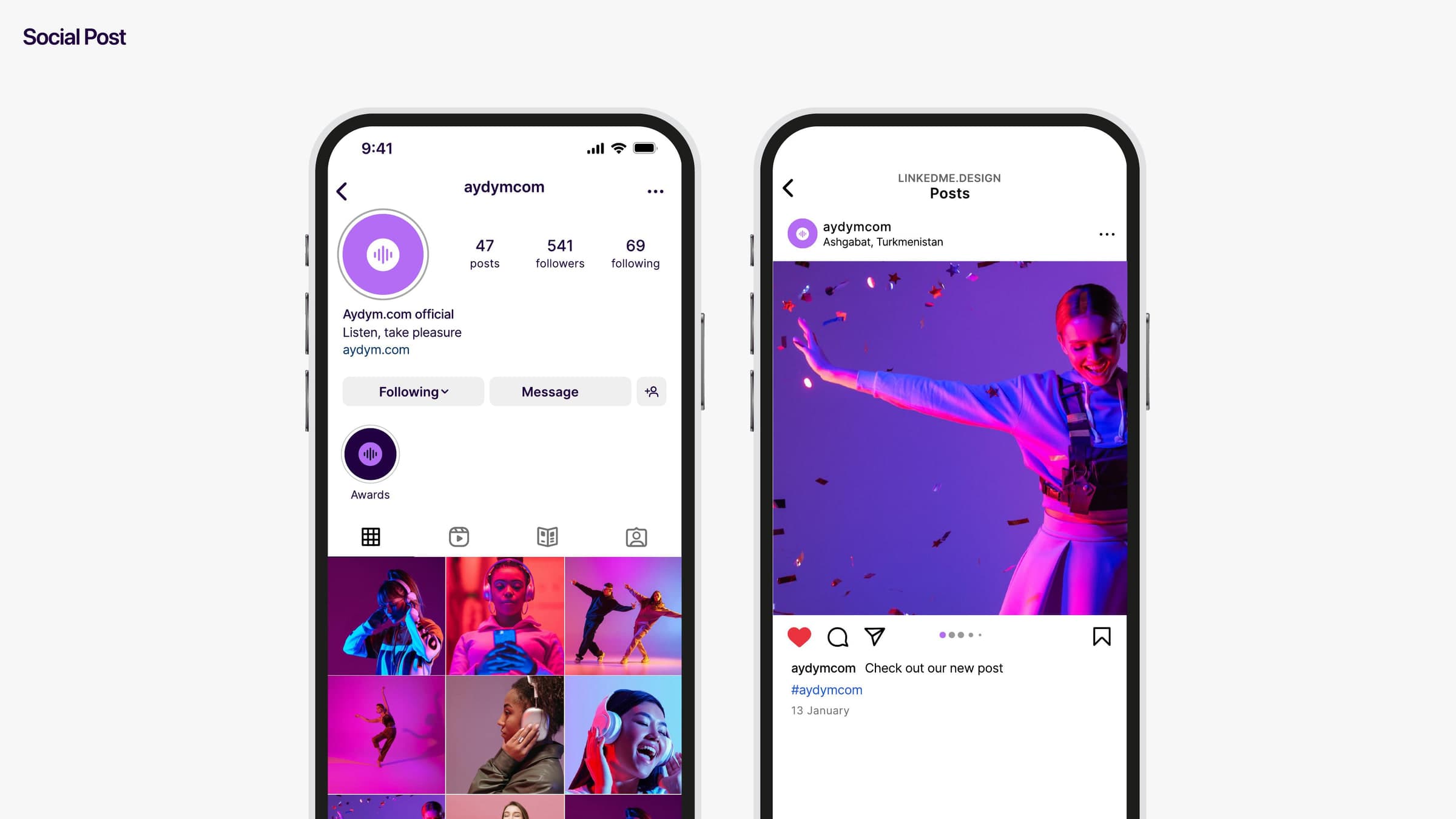
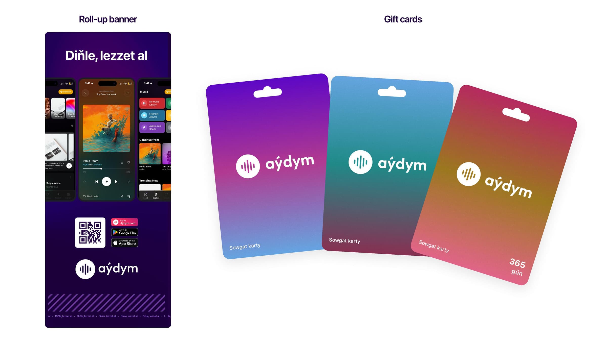
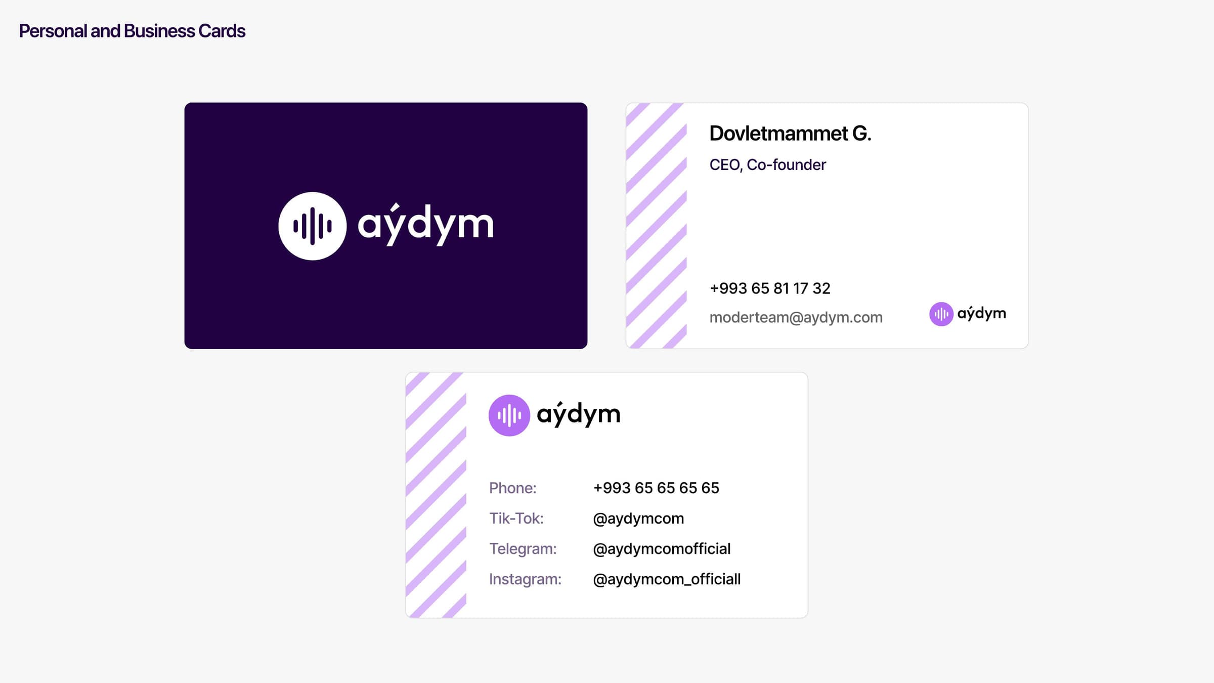
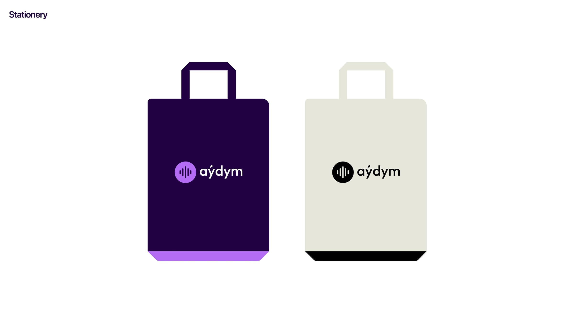
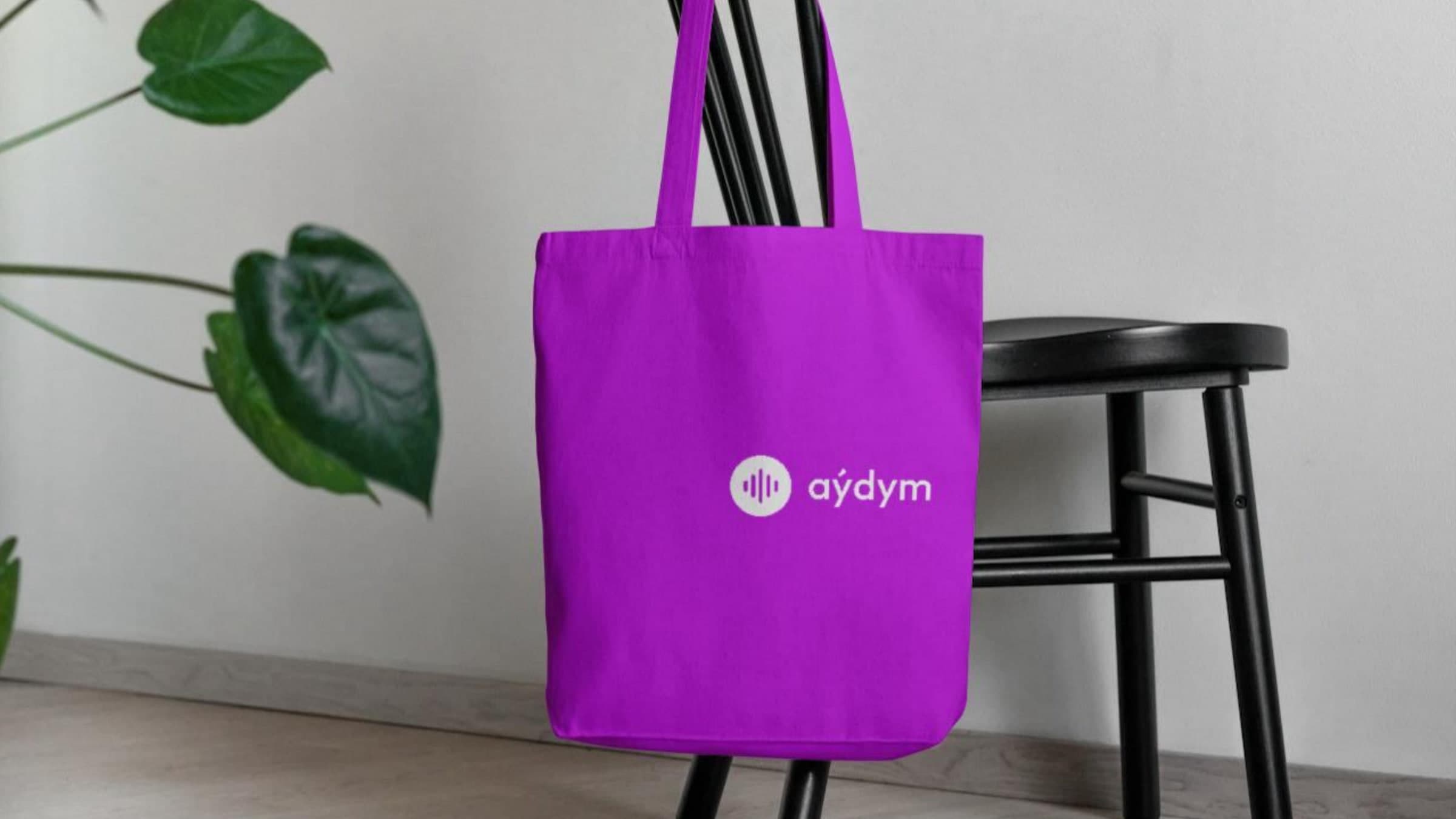
04 — Out in the world

0
pages of guidelines
0
colours, one of them leading
0
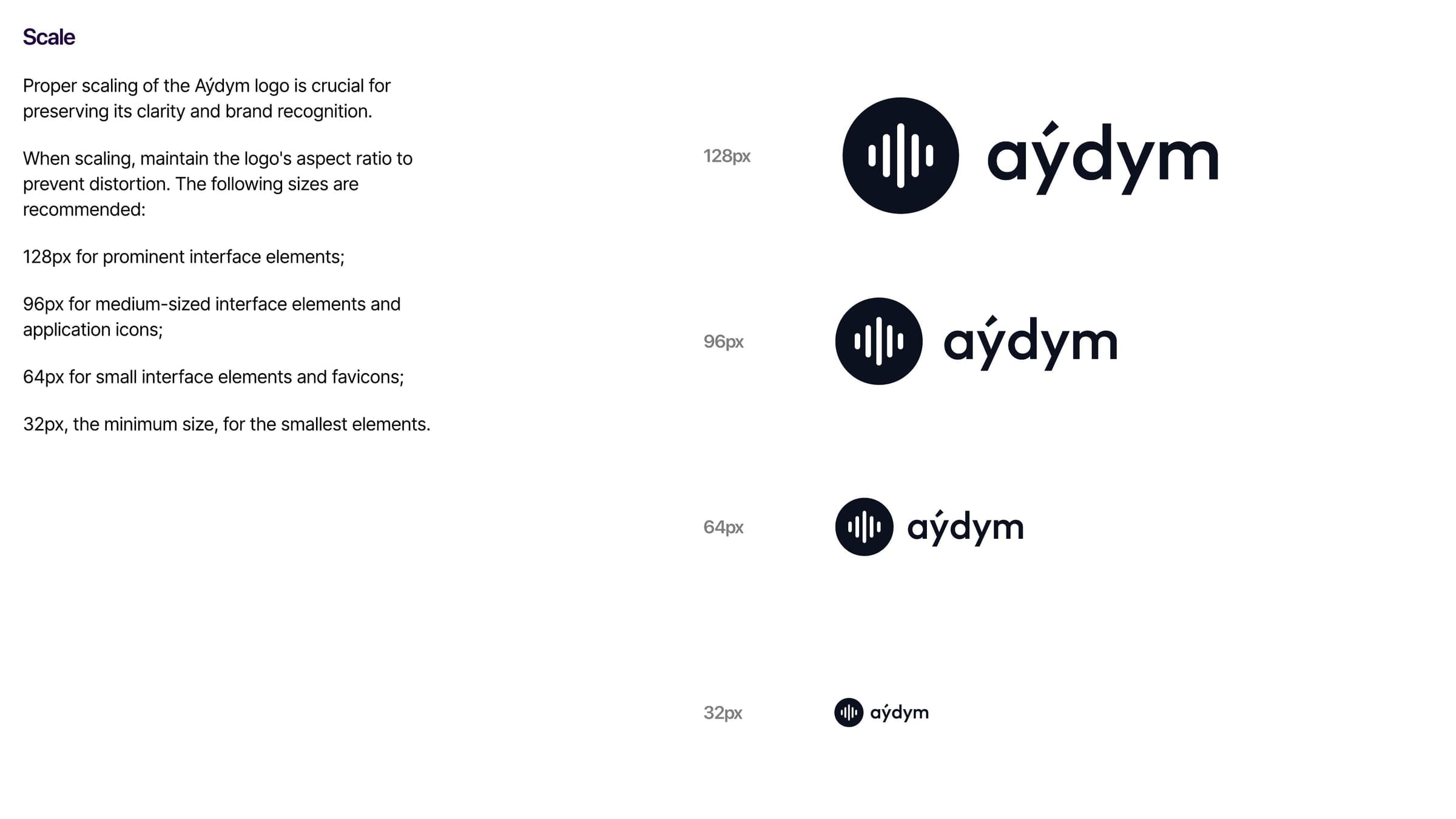
px — where the mark still reads
Handed over
One identity that holds from a 32 px favicon to a printed poster
A dark-first system, so the product and the brand stopped disagreeing
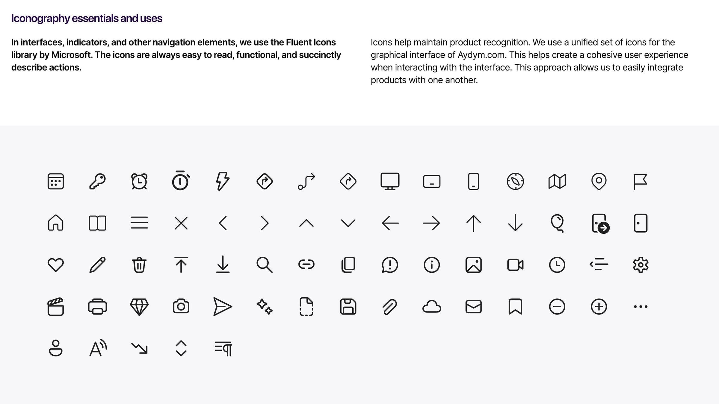
A 59-page book covering logo, colour, type, icons, photography, pattern and applications
aydym.com